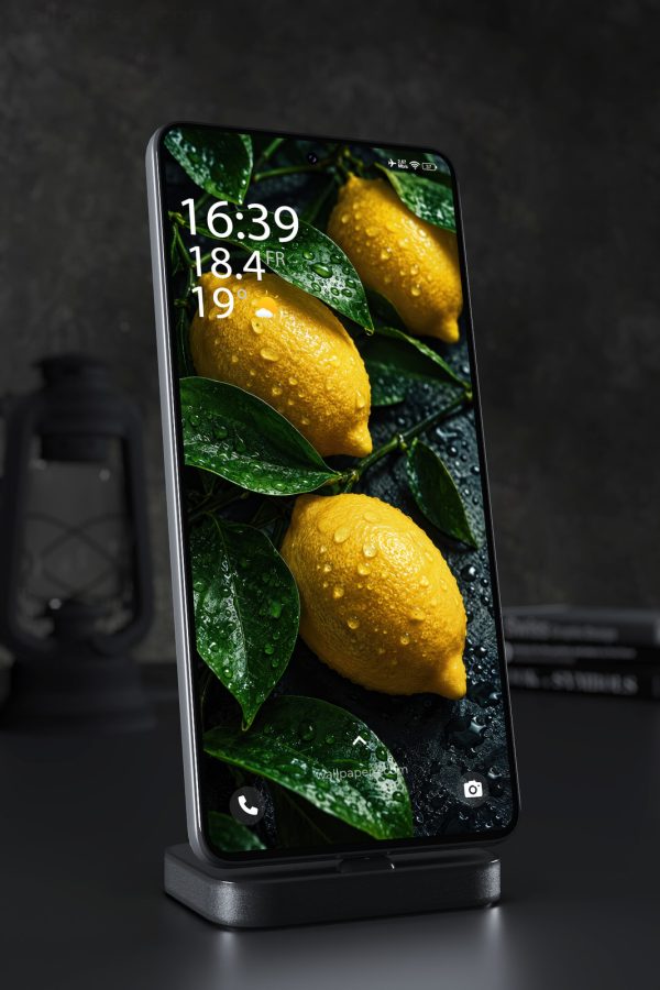
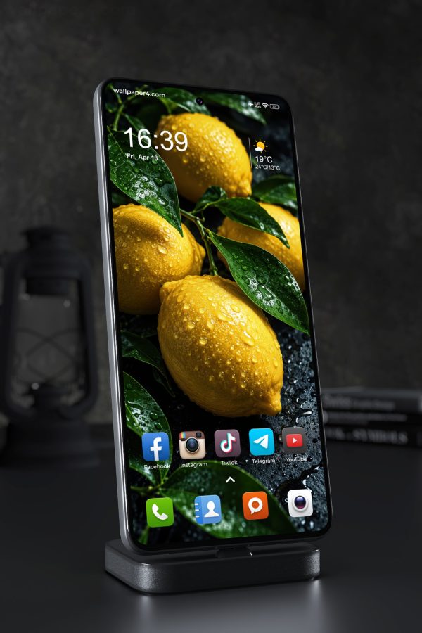
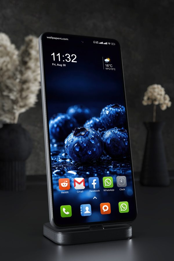
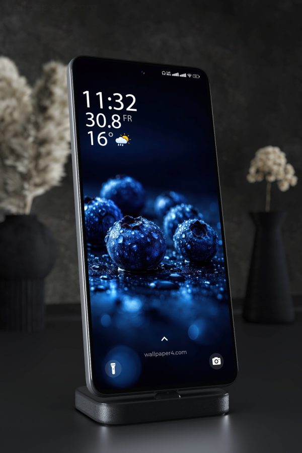
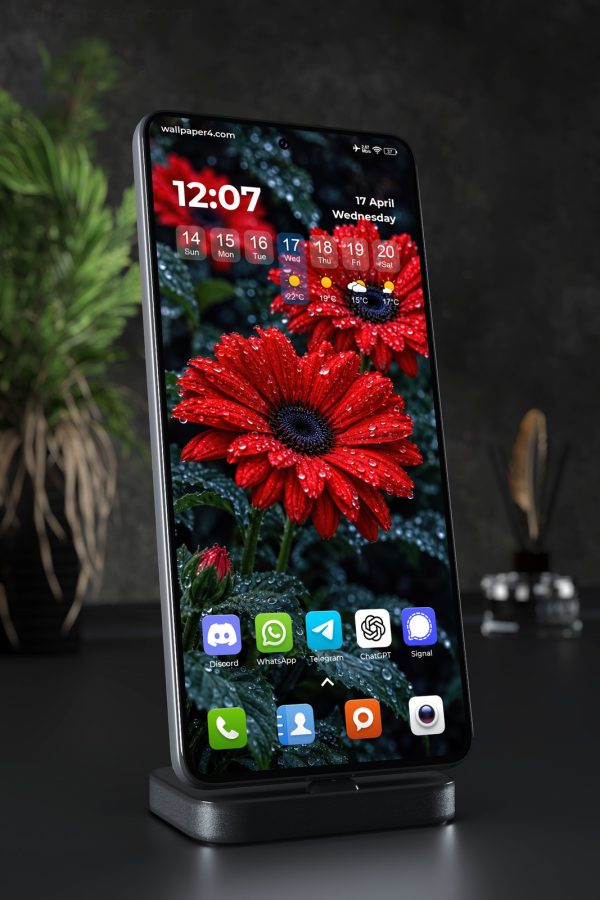
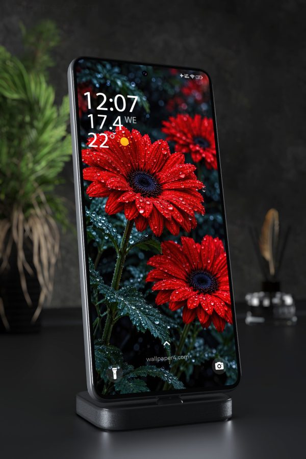
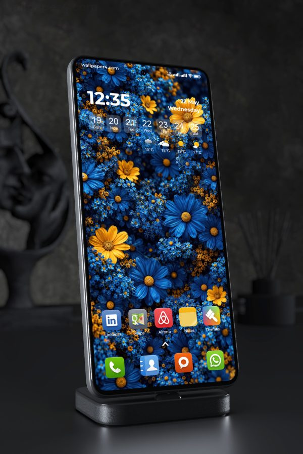
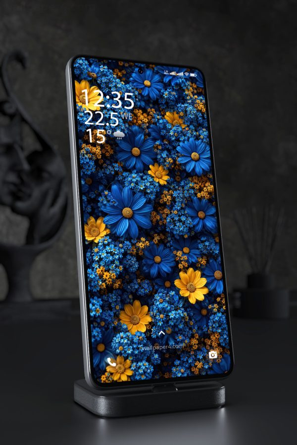
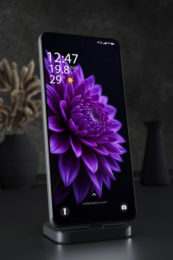
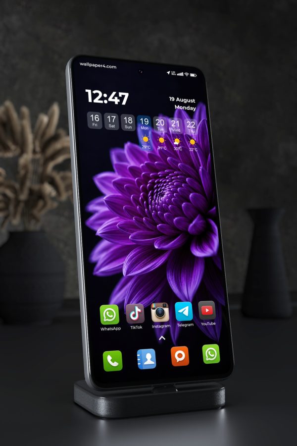
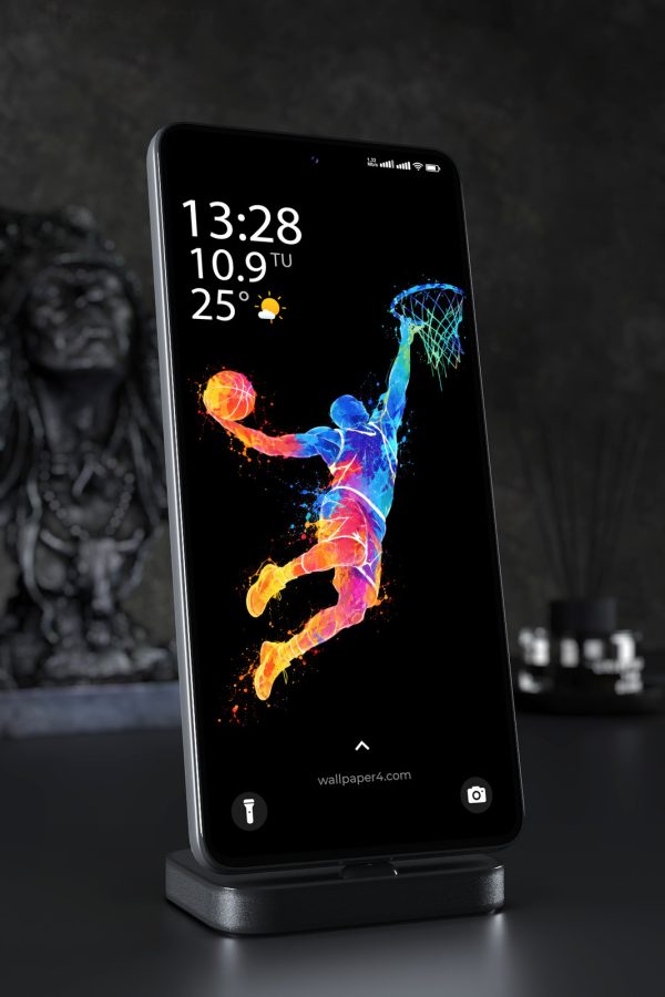
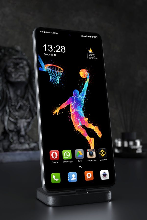
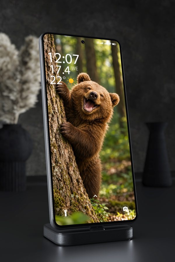
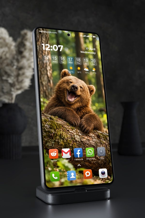
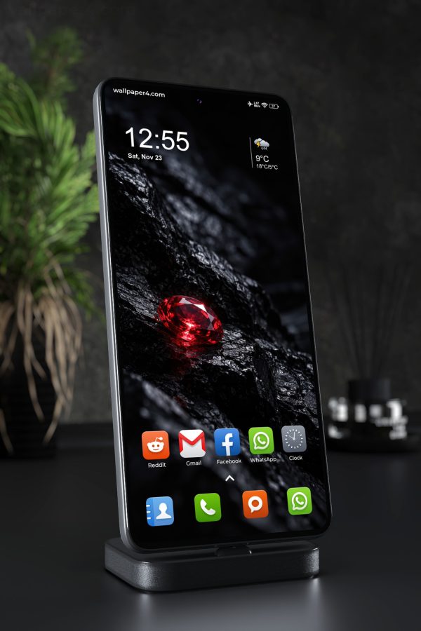
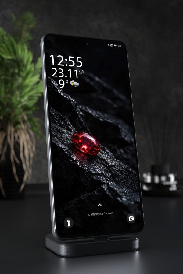
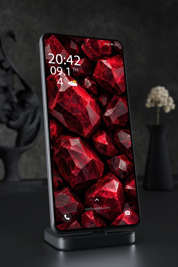
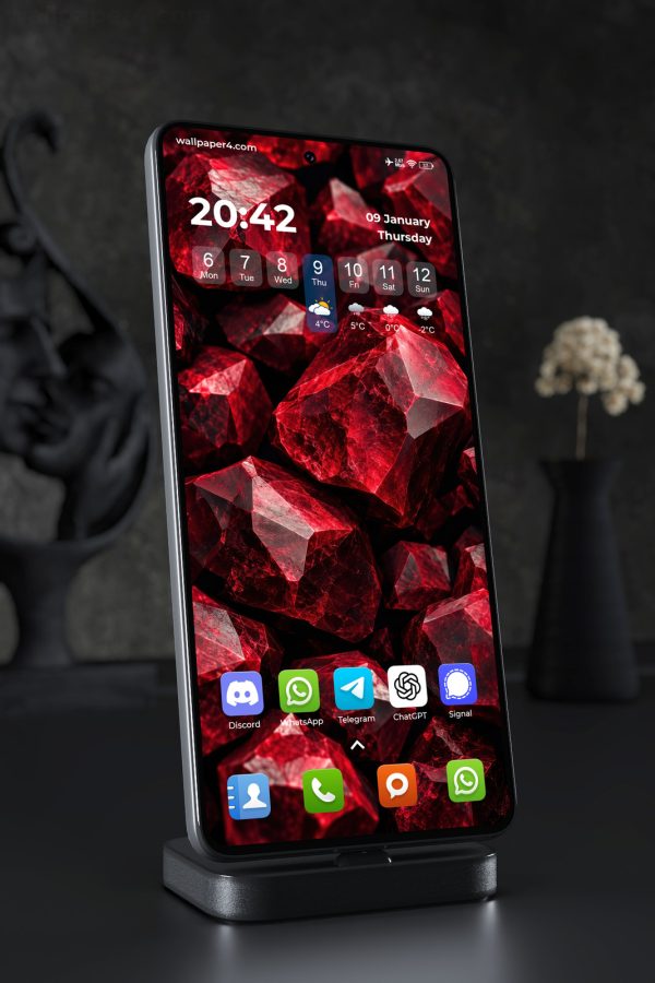
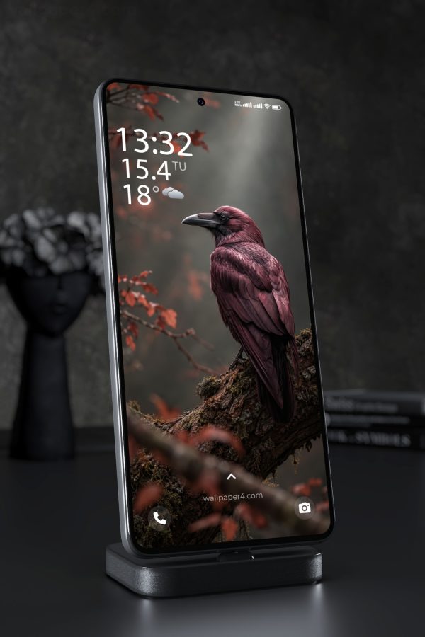
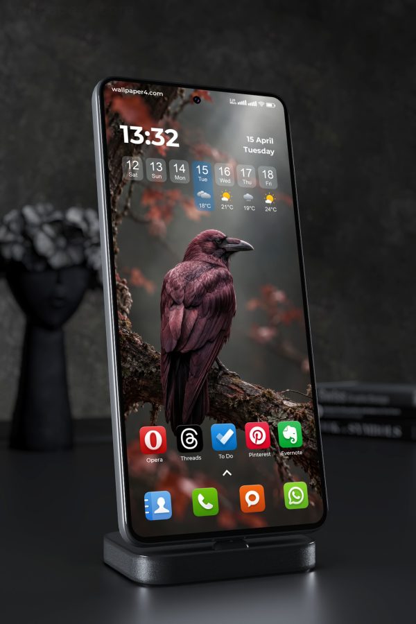
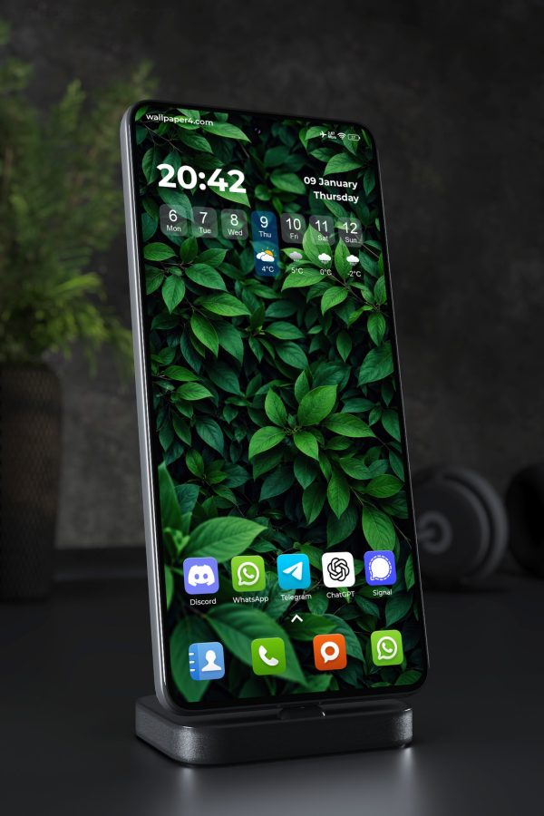
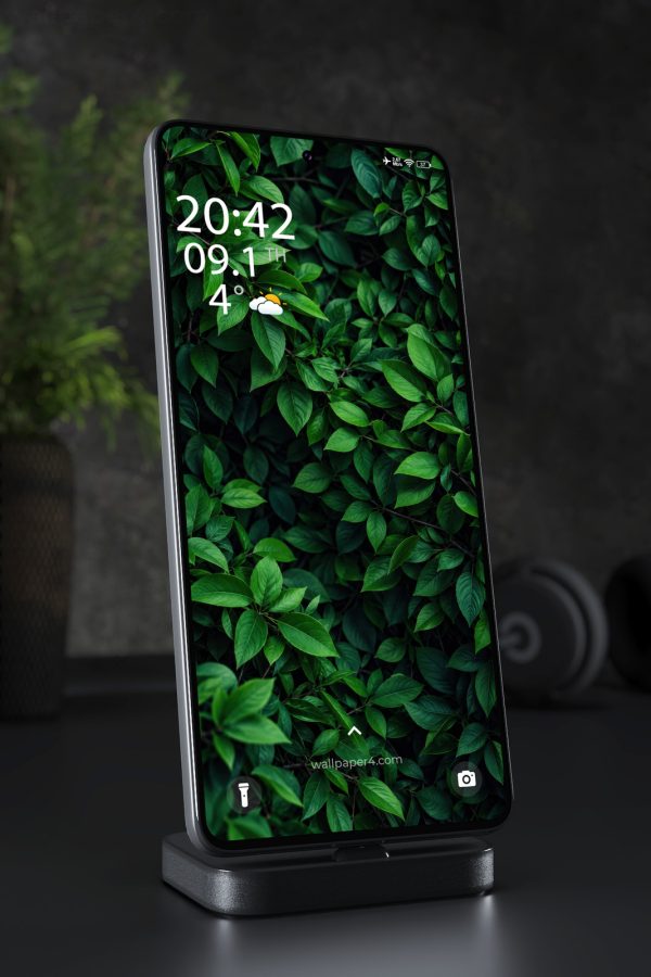
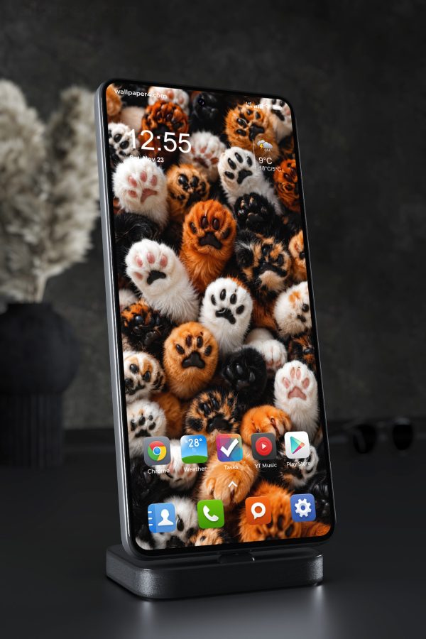
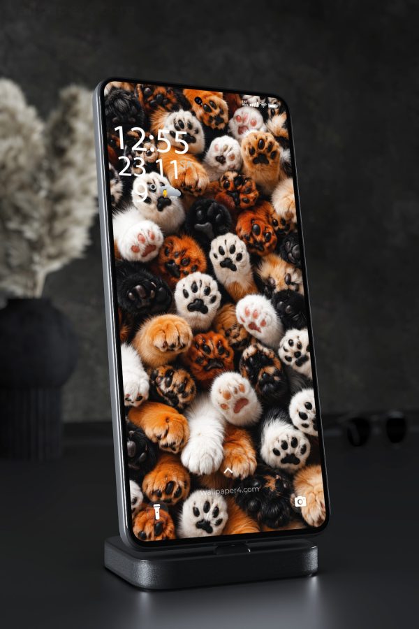
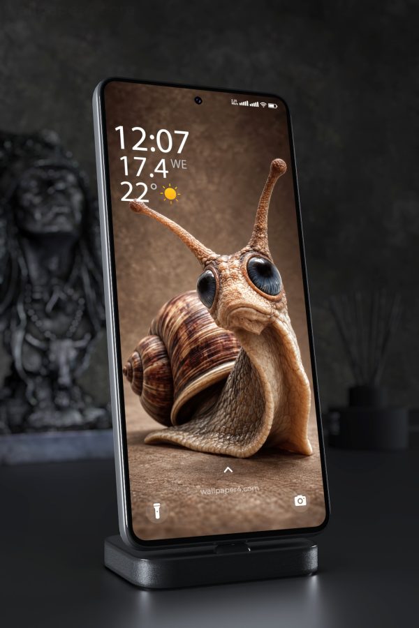
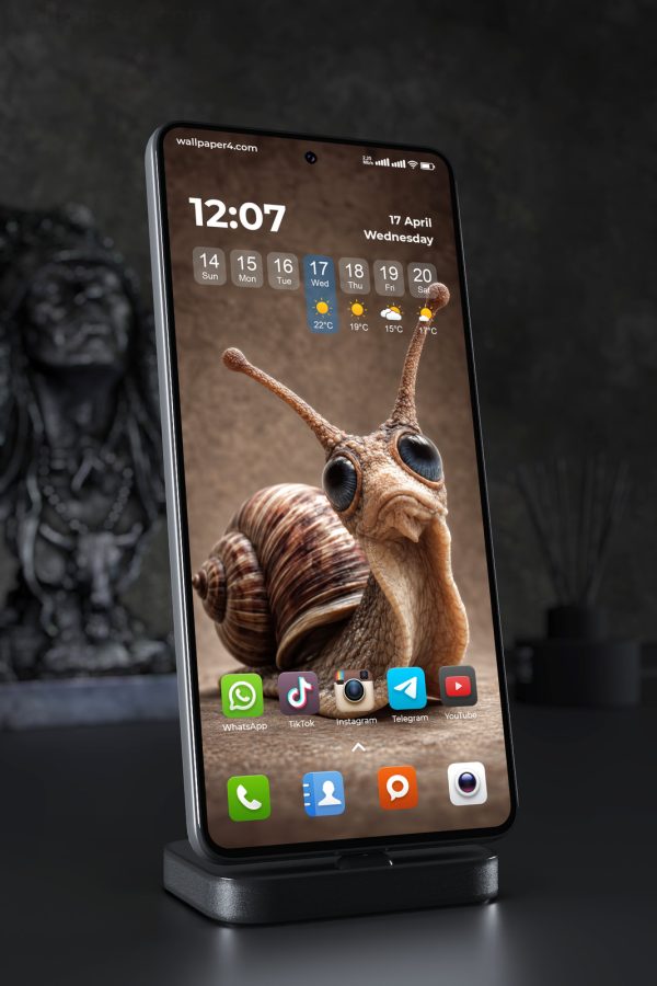
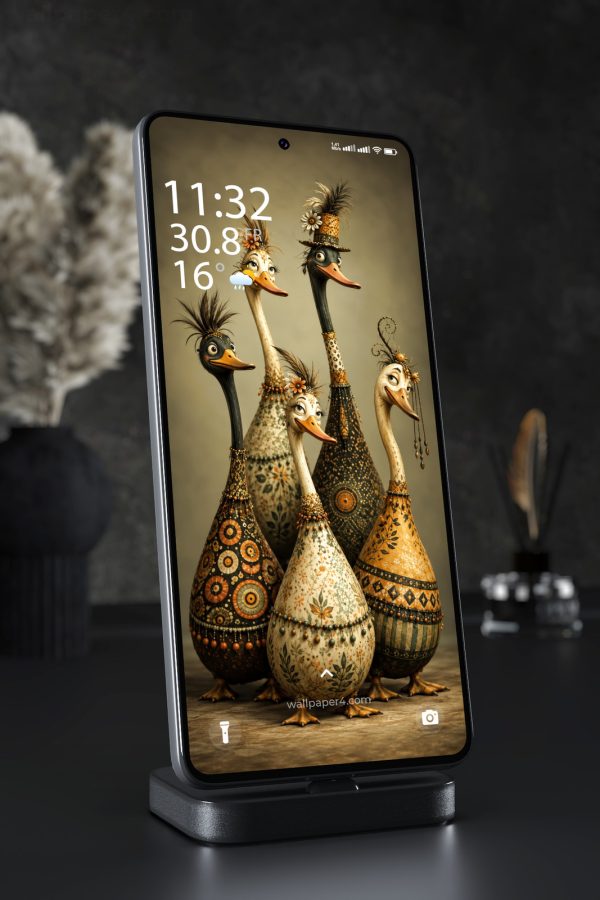
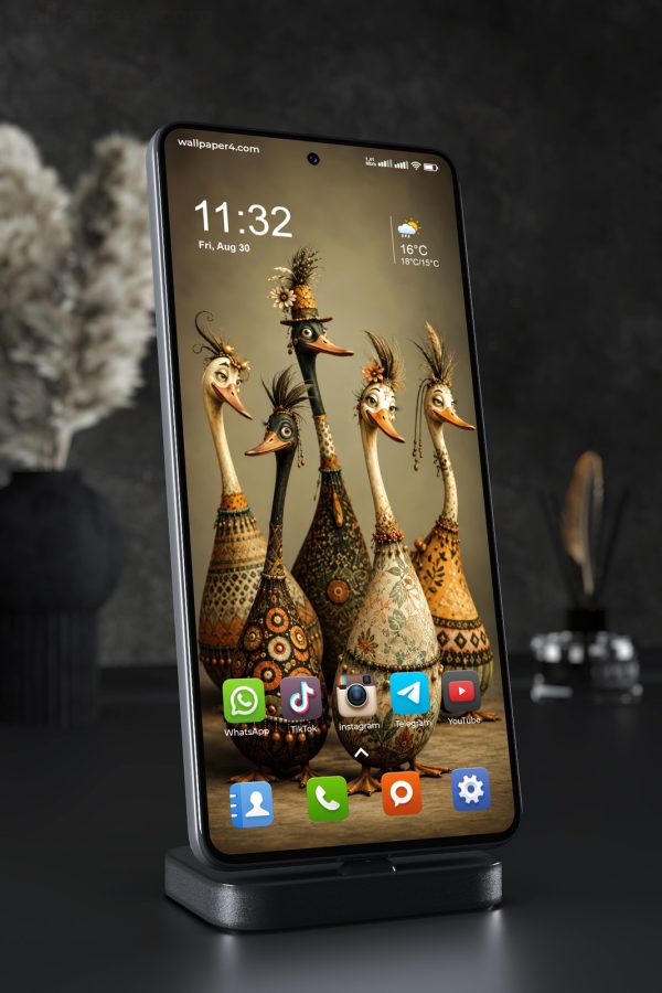
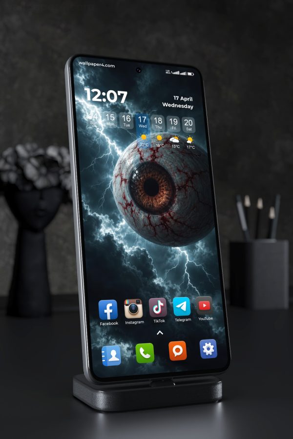
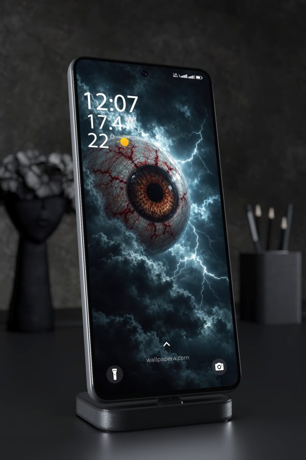
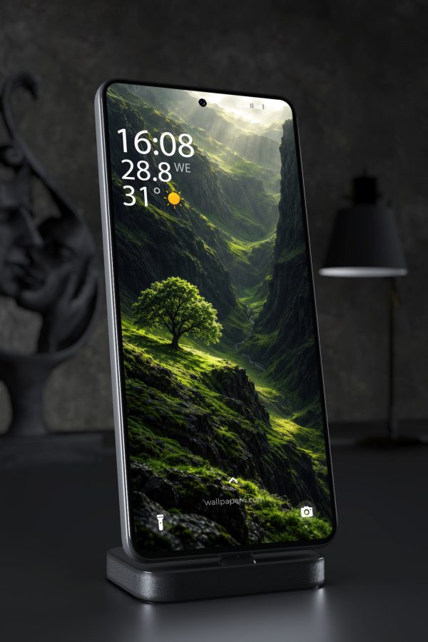
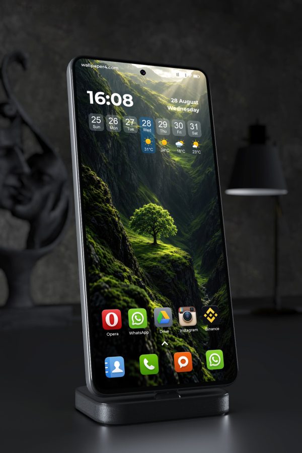
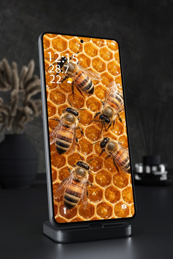
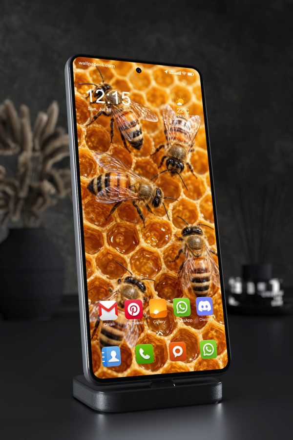
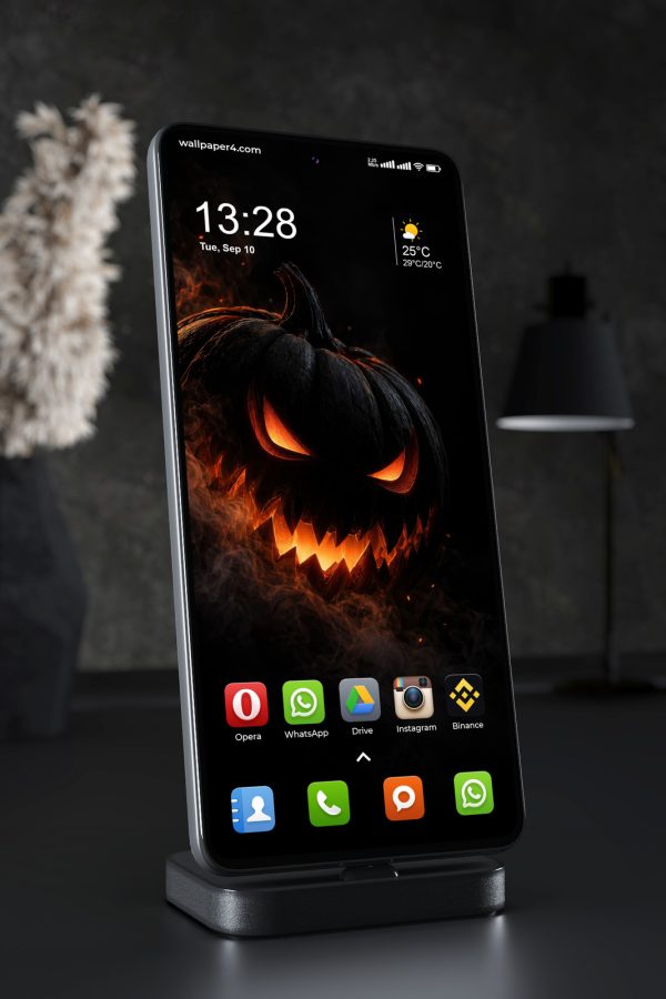
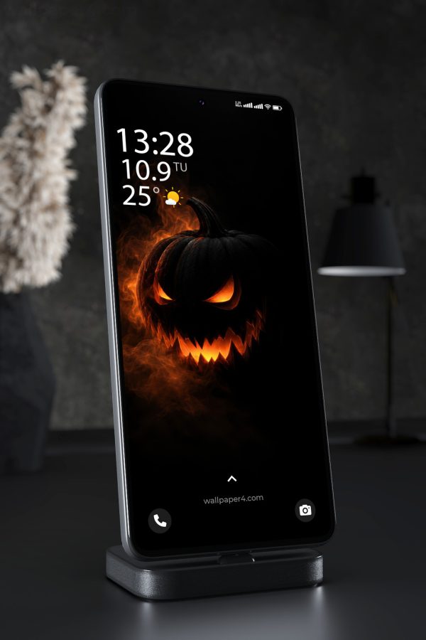
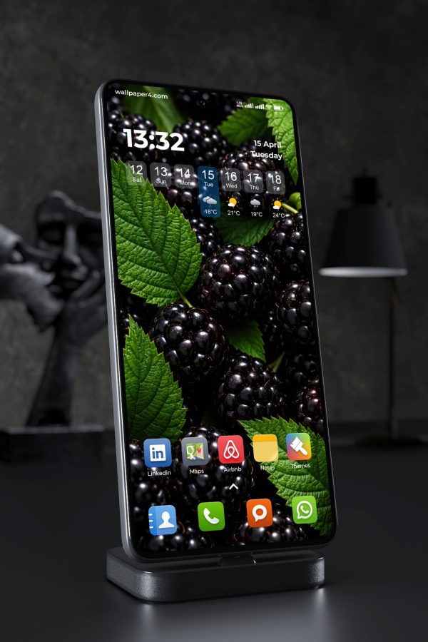
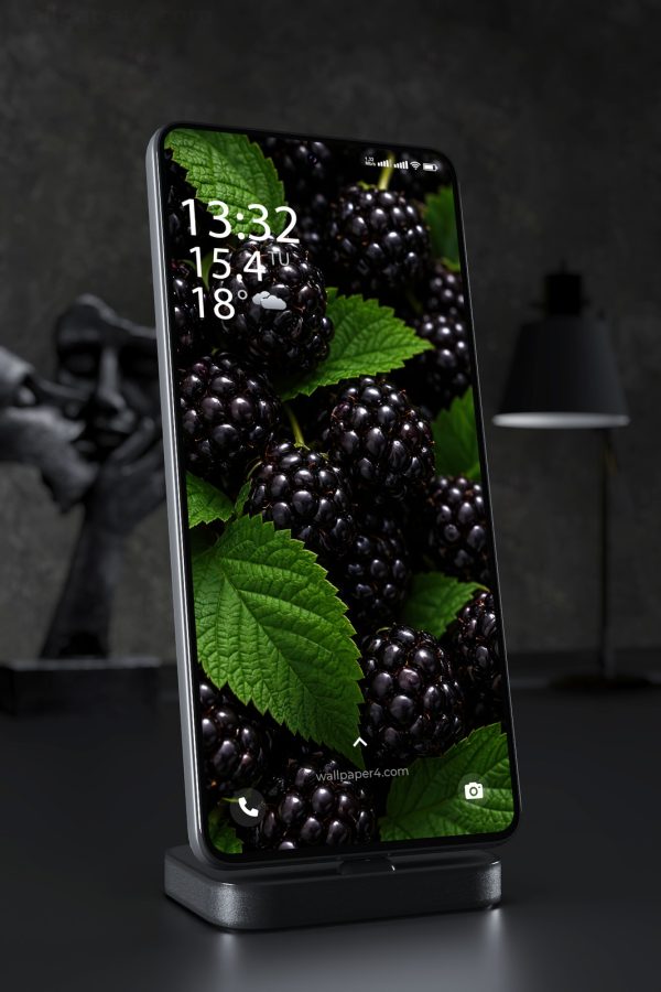
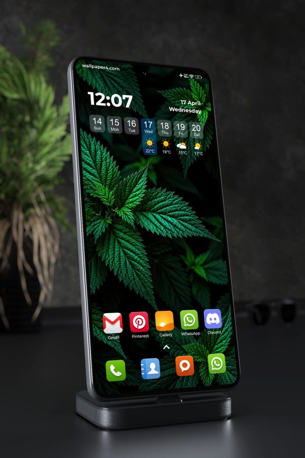
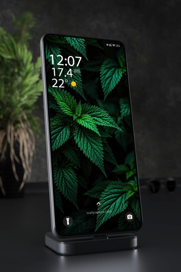
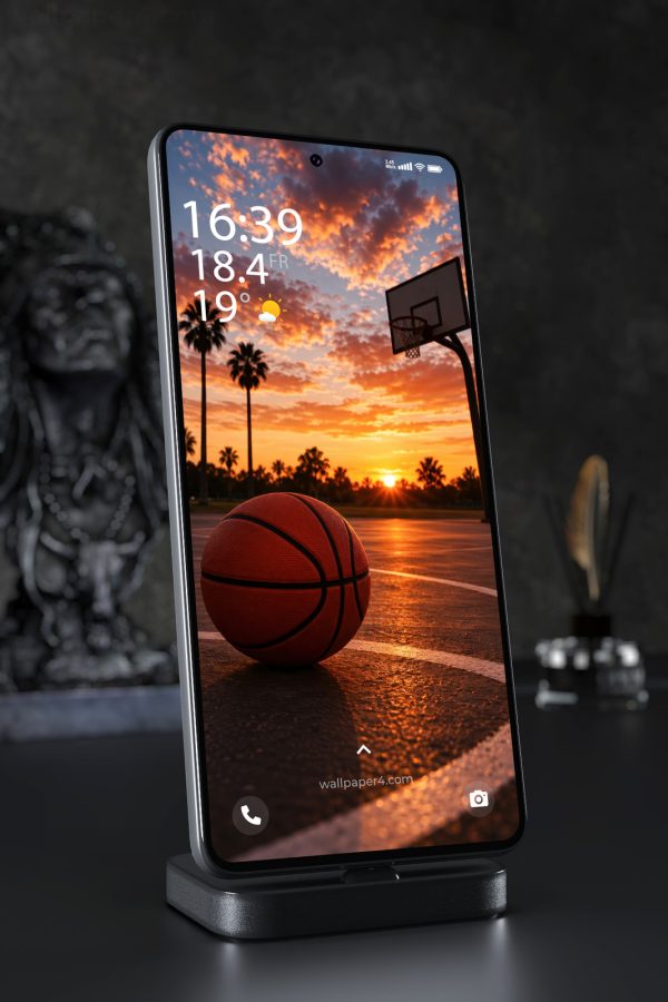
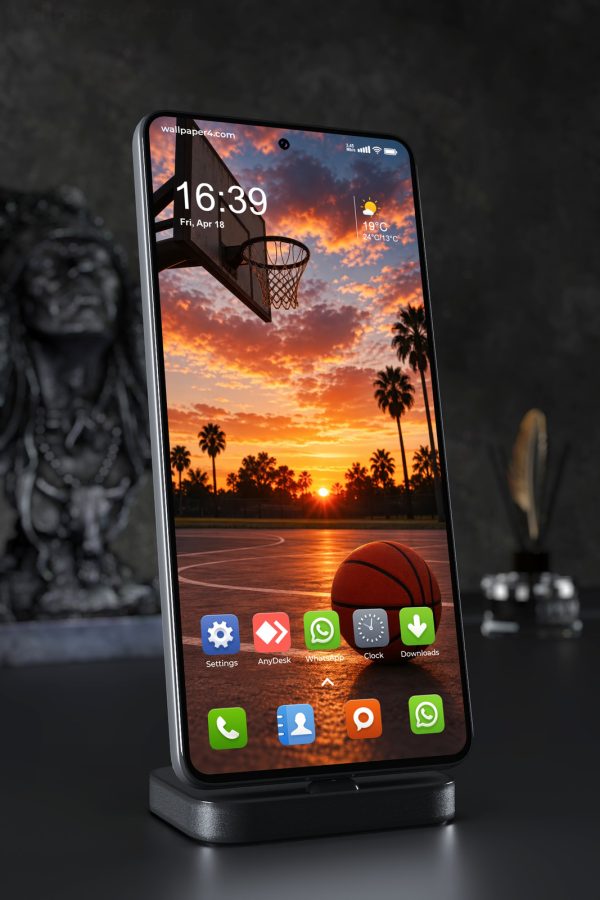
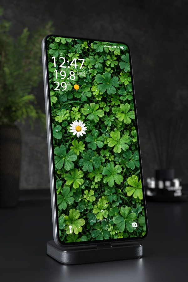
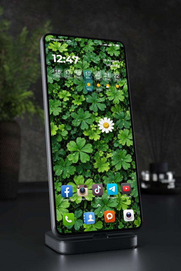
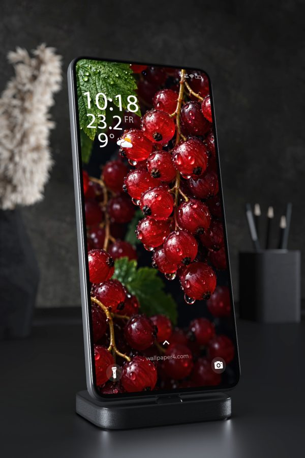
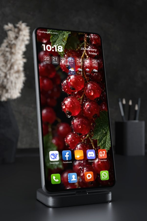
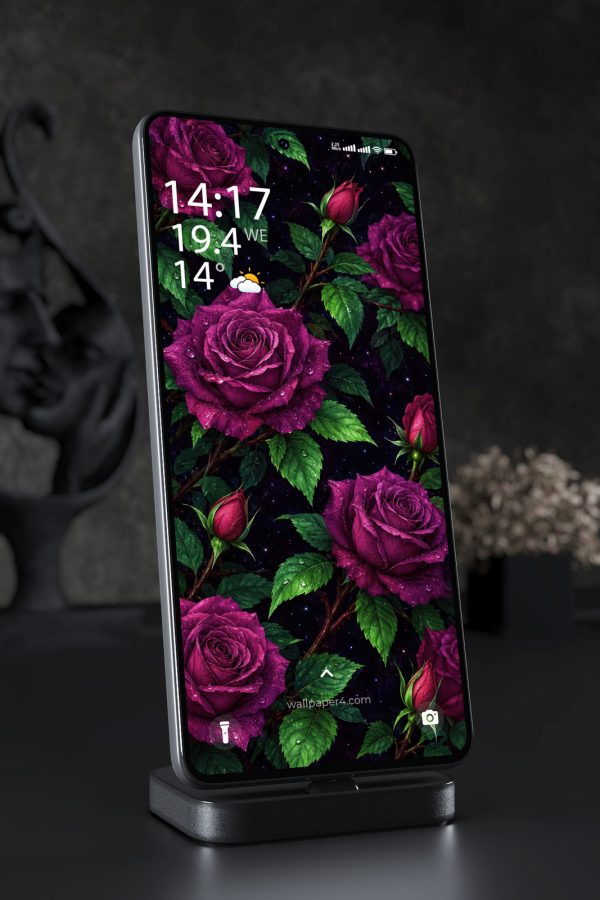
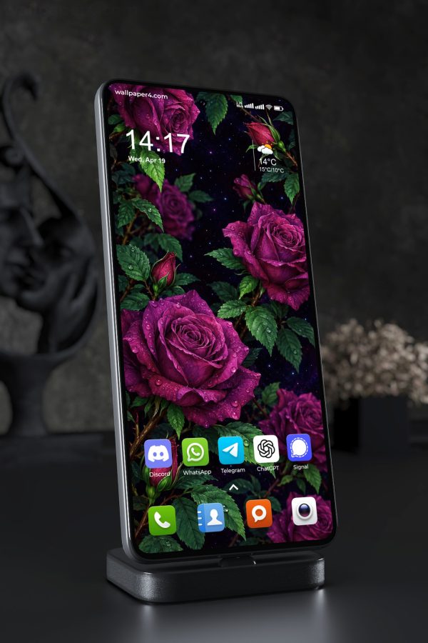
A wallpaper for phone screens works best when its composition respects the narrow vertical format. The focal point should remain visible around icons, widgets, and the clock, while important details should not disappear beneath interface elements. Simple backgrounds can create a quiet surface for daily use, while richer images benefit from clear spacing and a strong visual hierarchy.
Contrast matters as much as subject. Dark areas can make light icons easier to read, and softer tones may feel less dominant behind app grids. Bright colors, fine textures, or detailed scenes can still work well when the busiest parts sit away from frequently used controls. On phones with different crops or aspect ratios, a centered subject or flexible background often keeps the image balanced.
When choosing a phone wallpaper, consider how it looks both on the lock screen and behind apps. A striking image may suit the lock screen, where more of the artwork remains visible, while the home screen often benefits from calmer detail. Check the placement of faces, objects, text, or horizon lines before settling on a background. The most practical choice keeps its visual character without competing with the information you use throughout the day.